Hi guys!
Lately I feel the look of our PCC has become so stale and I would want to make some changes. It's been awhile since I last tinkered with it.
I have this thing on my mind about how I want PCC to look like. The template stays and the contents of third party programs stays. I am looking into the color change and combination.
I would like to have the colors of our Philippine flag for our blog. Would you like to help me out guys? I would appreciate it so much to hear your side.
Just remember, yellow, red, blue and white.... I'm thinking of having a look alike logo of "the sun" of Bandila of ABS-CBN's late night news.
Whatcha say?
Wika Para sa Lahat
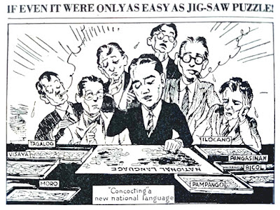
Magandang araw! Magandang hapon! Magandang gabi! If you understood any of the words or phrases I used, chances are that you know they come...

Looking for Something Here?
Thursday, August 16, 2007
Subscribe to:
Post Comments (Atom)
Scholastic Basketball Camp
1st Founders' Cup
Scholastic Basketball Camp-1st Founders' Cup
16 & Under Division Ranking 2019
| School | Rank | Wins |
|---|---|---|
| SV Montessori | 4th | 0 |
| La Trinidad Academy | Champion | 5 |
| Charis Christian Institute | 2nd | 4 |
| La Camelle School | 3rd | 1 |
12 & Under Division Ranking 2019
| School | Rank | Wins |
|---|---|---|
| SV Montessori | 5th | 0 |
| La Trinidad Academy-Team A | Champion | 6 |
| Charis Christian Institute | 2nd | 5 |
| La Camelle School | 3rd | 4 |
| La Trinidad Academy-Team B | 4th | 1 |

I think the red, white, and blue would not pose too much of a problem, but you need to be careful with how and where to apply the yellow. Whatever you do, make sure that the text doesn't end up mired in the background and thus hard to read. You could probably have red on one side and blue on the other side, and white in the central area where the text are primarily located. Yellow could be used as border color. Does blogspot allow for this kind of design manipulation?
ReplyDelete